
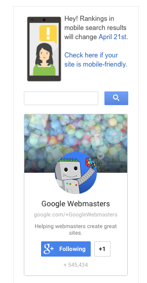
Will Mobilegeddon affect you? Take the mobile friendly test.
You can literally Run your site on a Google mobile-friendly test tool to find out. It will show if your platform is compliant and you are safe from search penalties, (if your site the site layout looks ok to Google search bots)
Google’s Mobile-Friendly Test Tool
It will detect these criteria
- Avoids software that is not common on mobile devices, like Flash
- Uses text that is readable without zooming
- Sizes content to the screen so users don’t have to scroll horizontally or zoom
- Places links far enough apart so that the correct one can be easily tapped
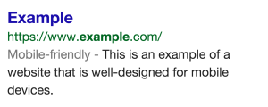
Passing the test also allows the ‘Mobile-Friendly” tag next to your listing, like this:

Ok my site works on a phone now. What’s Next?
Context.
Understanding context is the Key to a #UX strategy
— Chris Wiegman (@Sharp3d) April 22, 2015
That tool does not mean you have all the content, performance, or features working like you want on mobile (from a users perspective). What you want to do is list what does my avatar try to do when they pull your site up? Then try the flow through the pages on their typical device. Can you do it with a good User Experience (UX)? Or what do actual clients tell you they can’t do? Some of this mobile support should be making a new list of
Mobile UX tests:
A. Test the user flow you want people to do on a mobile device. Can you do that goal without errors?
B. Survey actual customers “What is their first impression of the website? And can they can use the site ok?”
- Layout bugs (CSS issues)
_____
_____ - Broken functionality (PHP and Javascript errors)
_____
_____ - Content on the mobile device, elements that should hidden, changed, or added
_____
_____
This is almost about more about psychology than being pretty. Your goal is for your site to be so good people use it without hurting your reputation. Having content that people are looking for, Showing a UX that is good-enough to use the site. And site setup that can adapt to the main devices (if you don’t ads are a waste). If you don’t know how many people are using mobile for your actual site — install Google Analytics
PSA – Check your site looks ok on phones. My client stats here show the rationale for #mobilegeddon is justified (in our case 44% is phone traffic!). A photo posted by Chris W (@sharp3d) on
I hope this helped. Let us know if you need help, some of these issues are tricky.
Understanding the context of your visitors not only helps you with planning UX, it’s helpful for the content and the conversation.